
You can customize the framework of the media player by creating and applying your own HTML skins.
A skin consists of a packaged .zip file containing a .css file and a sprite .png image file containing the component graphics. The .css file defines the settings for the skin's components: control bar, display, dock, and playlist. Use your favorite image editor to design and save the visual elements that make up the skin and link to them in the skin's .css file.
|
|
Skins used in Lectora 18.1.4 and older will no longer work. Use one of the skins available in Lectora 18.2 or convert, rebuild, or create your desired custom skin. The sprite image file should not have to change. |
To create a custom skin using the new format:
Create a sprite .png image file containing all of the images for the skin. Name the sprite .png image file the same as the name of your custom skin. Several sprite image creators are available on the Web. Having buttons that are the same width and height is recommended. Additionally, the images should be the same height that you want for the height of the controller.
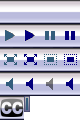
Note the X and Y position of each of the images in the sprite image file. These coordinates are needed when you create the .css file in step 3.
For example, here are the X and Y positions and dimensions for the example sprite image shown in Step 1:
| Skin Image | X,Y position | Width | Height |
| Background image | 0, 0 | 80 | 24 |
| Play button | 0, 24 | 20 | 24 |
| Play hover button | 20, 24 | 20 | 24 |
| Pause button | 40, 24 | 20 | 24 |
| Pause hover button | 60, 24 | 20 | 24 |
| Fullscreen button | 0, 48 | 20 | 24 |
| Fullscreen hover button | 20, 48 | 20 | 24 |
| Unfullscreen button | 40, 48 | 20 | 24 |
| Unfullscreen hover button | 60, 48 | 20 | 24 |
| Mute button | 0, 72 | 20 | 24 |
| Mute hover button | 20, 72 | 20 | 24 |
| Unmute button | 40, 72 | 20 | 24 |
| Unmute hover button | 60, 72 | 20 | 24 |
| Captions button | 0, 96 | 24 | 24 |
| TimeHandle | 24, 96 | 6 | 16 |
Create the .css file for the skin, guided by the provided sample CSS file below. Name the .css file the same as the skin is named within the file.
Depending on the name of your skin, replace sample accordingly.
For example:
sample is to be replaced with .yourSkinName
and sample.png is to be replaced with yourSkinName.png.
Sample:
div[id^="video"] .sample .mejs__controls {
        background: url(Sprites/sample.png) 0px 0px;
        height: 24px;
        bottom: -24px;
}
Your skin:
div[id^="video"] .yourSkinName .mejs__controls {
background: url(Sprites/yourSkinName.png) 0px 0px;
height: 24px;
bottom: -24px;
}
Each of the images that makes up the skin requires its respective CSS class.
For the background, use mejs__controls
that will point to the background image within the sprite.
this is done with background url(Sprites/sample.png) 0px 0px
where 0px 0px represents the X and Y position within the sprite image.
Use the classes for both audio and video accordingly as shown in the sample .css below.
Modify the height accordingly to your image. If you would like the control bar to be below the video, change the bottom property accordingly.
Replace the other controls with their respective image and sizes.
For example:
.sample .mejs__controls .mejs__pause button  {
        width: 20px;
        height: 24px;
        background: url(Sprites/sample.png) no-repeat -40px -24px;
        margin: 0;
        padding: 0;
}
Note that the x and y position are negative to show the appropriate CSS offset position.
For the time rail and volume slider, change the background color to your liking. Use RGBA values to display with an alpha transparency, and use a hex value as well to support older browsers.
Once the .css and sprite image files are complete, zip them together. The .zip name should match your .css file name.
Sample CSS File
|
/*Make sure that this matches the name of your .css file. For example, if your .css file is called sample.css, make sure this class is called .mejs__container.sample */ .mejs__container.sample { } /*This is the container for all of the controller elements.*/ .sample .mejs__controls { position:absolute; bottom:0; width:100%; }
/*These 2 ID blocks define the background image for the video/audio controller for Lectora.*/ div[id^="video"] .sample .mejs__controls { background: url(Sprites/sample.png) 0px 0px; height: 24px; bottom: -24px; }
div[id^="audio"] .sample .mejs__controls { background: url(Sprites/sample.png) 0px 0px; height: 24px; bottom: 0; }
/*These 2 ID blocks define the background image for the video/audio controller for Lectora Online.*/ div[id^="vid"] .sample .mejs__controls { background: url(Sprites/sample.png) 0px 0px; height: 24px; bottom: -24px; }
div[id^="sndtobj"] .sample .mejs__controls { background: url(Sprites/sample.png) 0px 0px; height: 24px; bottom: 0; }
/*This defines the position and size of the time-slider from left and top. The time-slider is the bar that shows the progress of the media file.*/ .sample .mejs__time-slider{ left:10px; top:4px; height:8px; display: inline-block; }
/*This sets the position of the time-slider relative to the width of the controller.*/ .sample .mejs__time{ top:0px; position:relative; }
/*This is the time code container.*/ .sample .mejs__controls .mejs__time { background:url(Sprites/sample.png) repeat-x 0 0; height:17px; position: relative; top: 0px; }
/*This is the media progress bar.*/ .sample .mejs__controls .mejs__time-rail { background:url(Sprites/sample.png) repeat-x 0 0; height:22px; }
/*This sets the color, or color and alpha depending on the browser, and height of the total time-slider bar.*/ .sample .mejs__controls .mejs__time-rail .mejs__time-total { background: #383838; background: rgba(0,0,0,0.6); height: 8px; }
/*This sets the height of the buffering time-slider bar.*/ .sample .mejs__controls .mejs__time-rail .mejs__time-buffering { height: 8px;
}
/*This sets the color, or color and alpha depending on the browser, and height of the loaded time-slider bar.*/ .sample .mejs__controls .mejs__time-rail .mejs__time-loaded { background: #808080; background: rgba(128,128,128,0.3); width: 0; height: 8px; }
/*This sets the color, or color and alpha depending on the browser, and height of the current time-slider bar.*/ .sample .mejs__controls .mejs__time-rail .mejs__time-current { background: #335D7C; background: rgba(51,93,124,0.8); width: 0; height: 8px; }
/*This defines the look and position of the time-handle of the time-slider.*/ .sample .mejs__controls .mejs__time-rail .mejs__time-handle { display: block; border:none; margin: 0; width: 6px; left: -3px; height: 16px; top: -5px; background: url(Sprites/sample.png) no-repeat -24px -96px; }
/*This would describe the time-float, but this skin does not use one.*/ .sample .mejs__controls .mejs__time-rail .mejs__time-float { display: none; }
/*This defines the size and position of the play/pause buttons.*/ .sample .mejs__controls .mejs__playpause-button { top: 0px; left: 0px; width: 20px; height: 24px; }
/*This defines the play button tag.*/ .sample .mejs__controls .mejs__playpause-button button { width: 20px; height: 24px; background: url(Sprites/sample.png) no-repeat 0 -24px; margin: 0; padding: 0; left: 10px; }
/*This defines the pause button tag.*/ .sample .mejs__controls .mejs__pause button { width: 20px; height: 24px; background: url(Sprites/sample.png) no-repeat -40px -24px; margin: 0; padding: 0; left: 10px; }
/*This defines the play button hover state*/ .sample .mejs__controls .mejs__playpause-button button:hover { background: url(Sprites/sample.png) no-repeat -20px -24px; }
/*This defines the pause button hover state*/ .sample .mejs__controls .mejs__pause button:hover { background: url(Sprites/sample.png) no-repeat -60px -24px; }
/*This defines the size and position of the fullscreen/unfullscreen buttons.*/ .sample .mejs__controls .mejs__fullscreen-button { top: 0px; right: 12px; width: 20px; height: 44px; background : none; }
/*This defines the fullscreen button.*/ .sample .mejs__controls .mejs__fullscreen-button button { width: 20px; height: 24px; background: transparent url(Sprites/sample.png) no-repeat 0 -48px; margin: 0; padding: 0; }
/*This defines the unfullscreen button tag.*/ .sample .mejs__controls .mejs__unfullscreen button { background: transparent url(Sprites/sample.png) no-repeat -40px -48px; margin: 0; padding: 0; }
/*This defines the fullscreen button hover state.*/ .sample .mejs__controls .mejs__fullscreen-button button:hover { background: transparent url(Sprites/sample.png) no-repeat -20px -48px; }
/*This defines the unfullscreen button hover state.*/ .sample .mejs__controls .mejs__unfullscreen button:hover{ background: transparent url(Sprites/sample.png) no-repeat -60px -48px; }
/*This defines the size and position of the mute/unmute buttons.*/ .sample .mejs__controls .mejs__volume-button { top: 0px; right: 0px; width: 20px; height: 24px; }
/*This defines the mute button tag.*/ .sample .mejs__controls .mejs__mute button { background: url(Sprites/sample.png) no-repeat 0 -72px; width: 20px; height: 24px; margin: 0; padding: 0; }
/*This defines the unmute button tag.*/ .sample .mejs__controls .mejs__unmute button { background: url(Sprites/sample.png) no-repeat -40px -72px; width: 20px; height: 24px; margin: 0; padding: 0; }
/*This defines the mute button hover state.*/ .sample .mejs__controls .mejs__mute button:hover { background: url(Sprites/sample.png) no-repeat -20px -72px; }
/*This defines the unmute button hover state.*/ .sample .mejs__controls .mejs__unmute button:hover { background: url(Sprites/sample.png) no-repeat -60px -72px; }
/*These properties define the look and size of the outer background of the pop-up vertical volume slider.*/ .sample .mejs__controls .mejs__volume-button .mejs__volume-slider { background: #C0C1E0; border: solid 1px #FFFFFF; border-width: 1px 1px 0 1px; width: 20px; height: 65px; top: -65px; left: 5px; }
/*These properties define the inner background of the volume slider.*/ .sample .mejs__controls .mejs__volume-button .mejs__volume-total { background: #333333; background: rgba(0,0,0,0.8); left: 9px; width: 6px; height: 50px; }
/*These properties define the look of the volume slider amount.*/ .sample .mejs__controls .mejs__volume-button .mejs__volume-current { width: 6px; background: #335D7C; background: rgba(51,93,124,0.8); height: 50px; }
/*This property would define a volume slider handle. This skin does not use one.*/ .sample .mejs__controls .mejs__volume-button .mejs__volume-handle { display: none; }
/*This defines the text color of the time code.*/ .sample .mejs__controls .mejs__time span { color: #000000; }
/*This is the container that wraps the current time code.*/ .sample .mejs__controls .mejs__currenttime-container { position: absolute; top: 32px; right: 100px; border: solid 1px #999999; background: #333333; color: #FFFFFF; padding-top: 2px; border-radius: 3px; }
/*This is the container that wraps the length time code.*/ .sample .mejs__controls .mejs__duration-container { position: absolute; top: 32px; right: 65px; border: solid 1px #999999; background: #FFFFFF; color: #333333; padding-top: 2px; border-radius: 3px; color: #333333; }
/*This defines the size and position of the captions button.*/ .sample .mejs__controls .mejs__captions-button { position:relative; width:24px; right:4px; top:0px; }
/*This defines the captions button tag.*/ .sample .mejs__controls .mejs__captions-button button { width:24px; height:24px; left:-1px; top:0px; background: url(Sprites/sample.png) no-repeat 0 -96px; } |
You can import skins and add them to the list of skins that can be applied to the audio and video controllers. For details about applying a skin to the audio controller, see Applying a skin to the audio controller. For details about applying a skin to the video controller, see Applying a skin to the video controller.
|
See also: |
© Copyright eLearning Brothers 2021